Analyze
Real-time Analytics

James
Last Update 4 years ago
All data and feedback collected through events and surveys are summarized in the “Analyze” tab. You can view data across each metric measured, see past event feedback, and review survey results.
Walkthrough each step below to learn more.
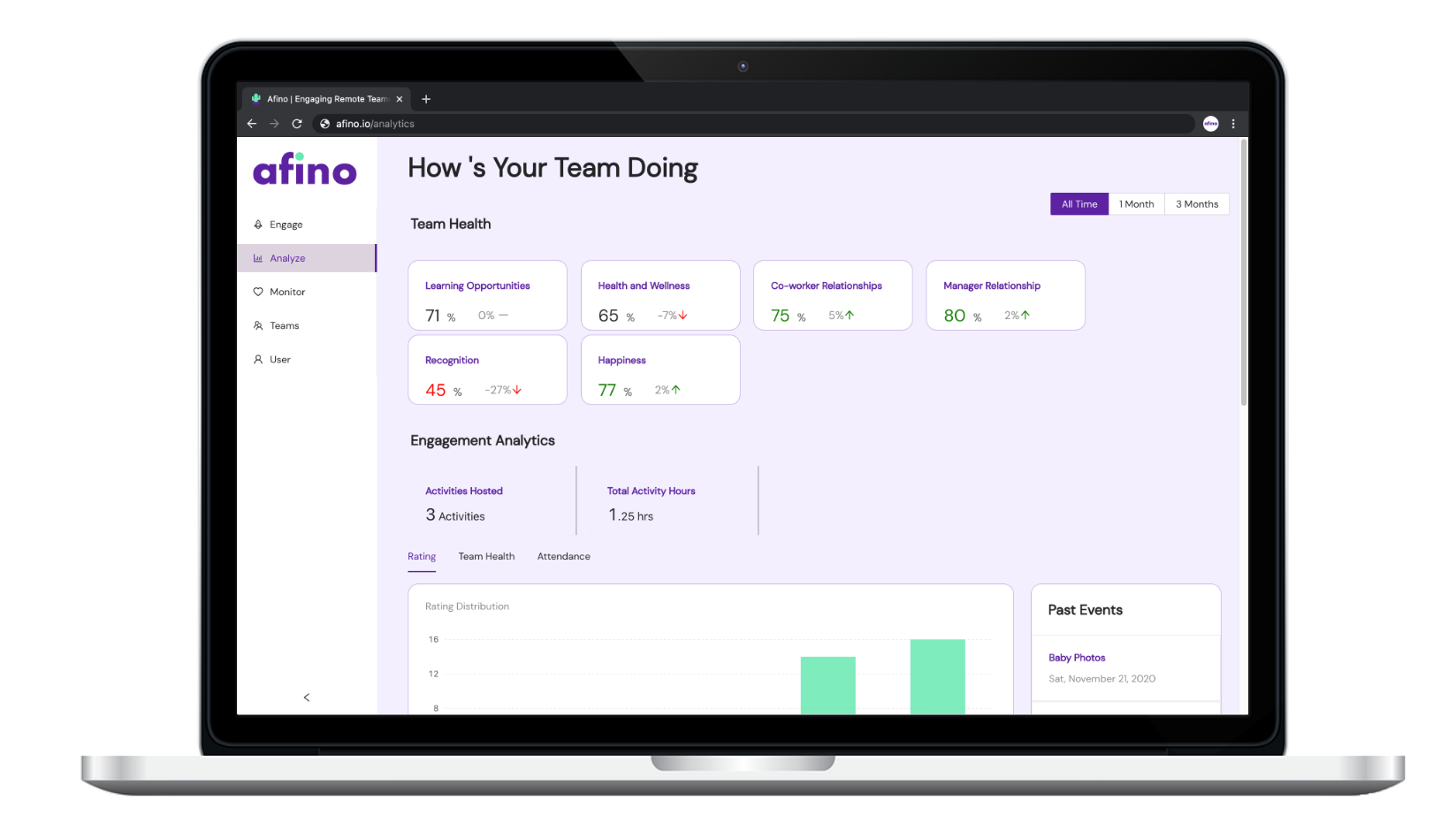
Step 1a) Click the “Analyze” tab to begin. The Team Health section summarizes data collected across each of the metrics we described earlier. Numbers are colour categorized to reflect how your team stacks up against other companies in your industry. Green numbers mean above average, black numbers equal average, and red numbers mean below average. Use these categories to help identify what areas you can improve with your team. To take a deeper dive, click on a card (like “Health & Wellness”).
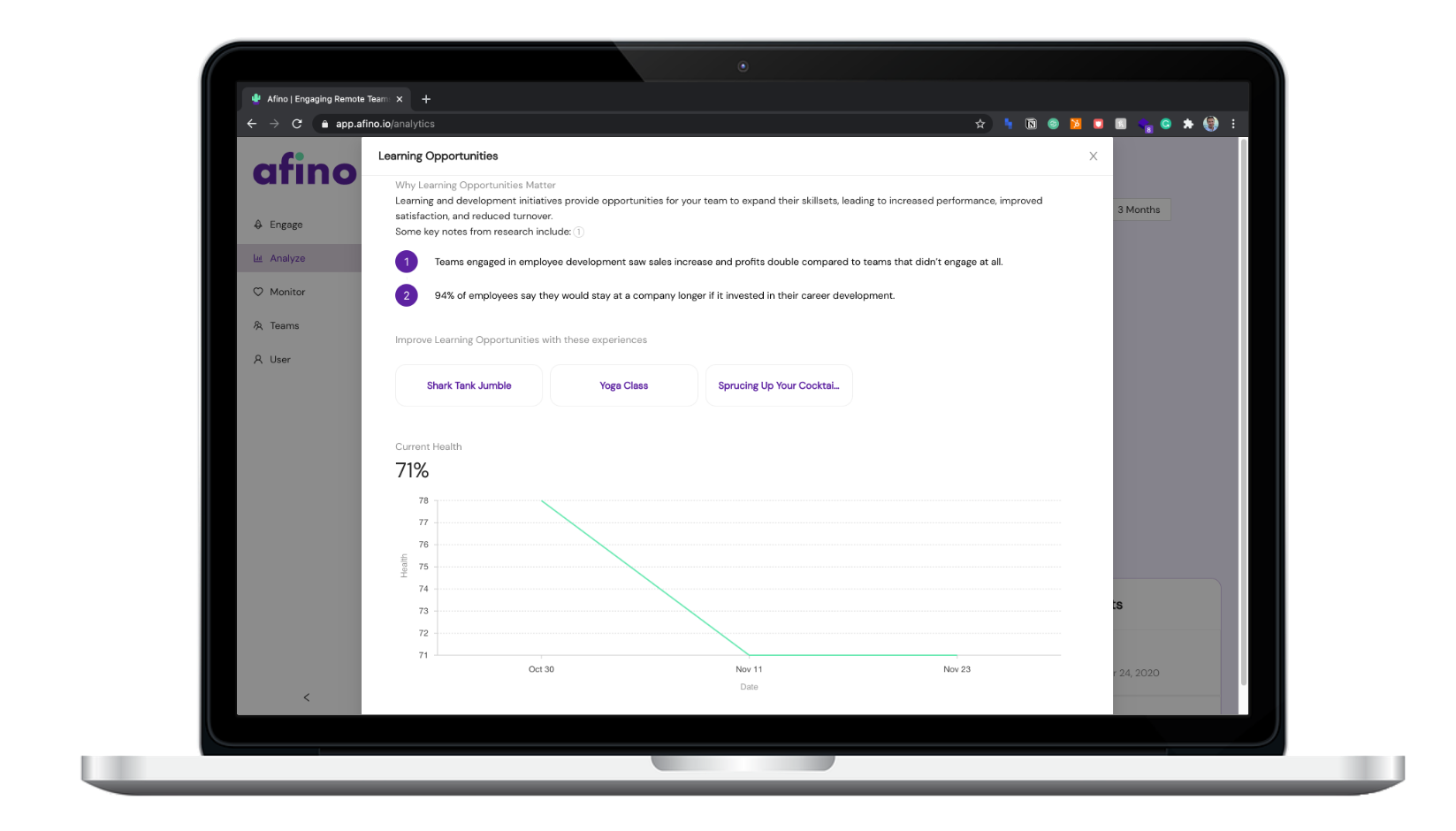
Step 1b) This will show you a graphical representation of how metrics have trended over time. You will also get customized suggestions of what you can do with your team on Afino to improve these metrics at the bottom.
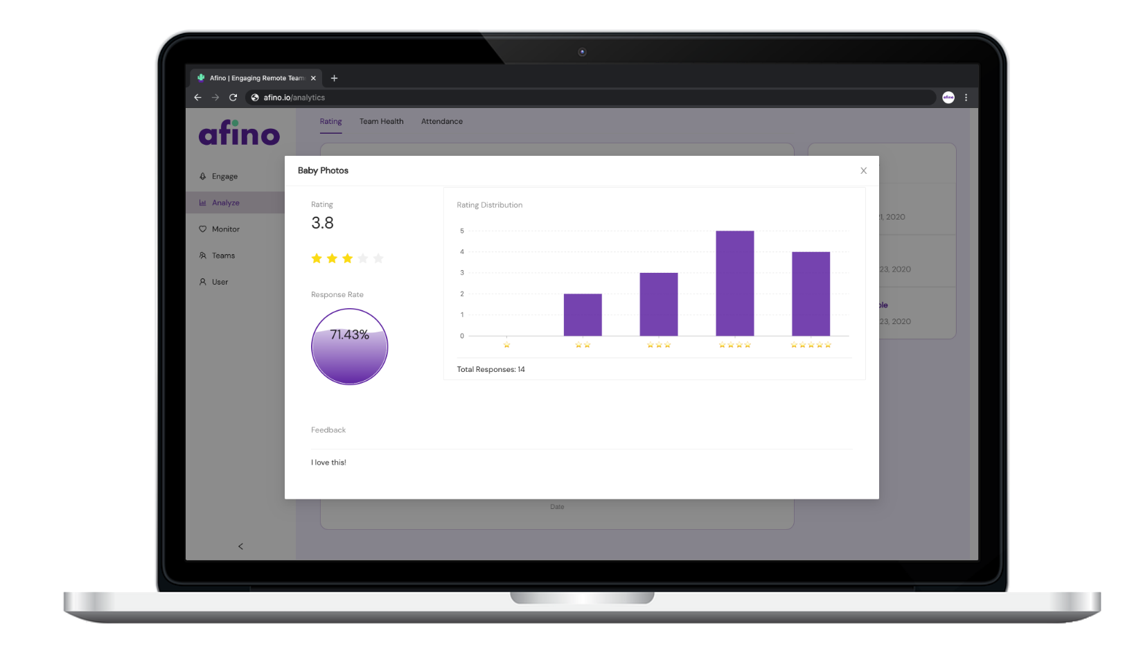
Step 2a) The Engagement Analysis section gives you more visuals on event ratings, team health, and event attendance levels. You can also review past event data and feedback by clicking one of the events on the right.
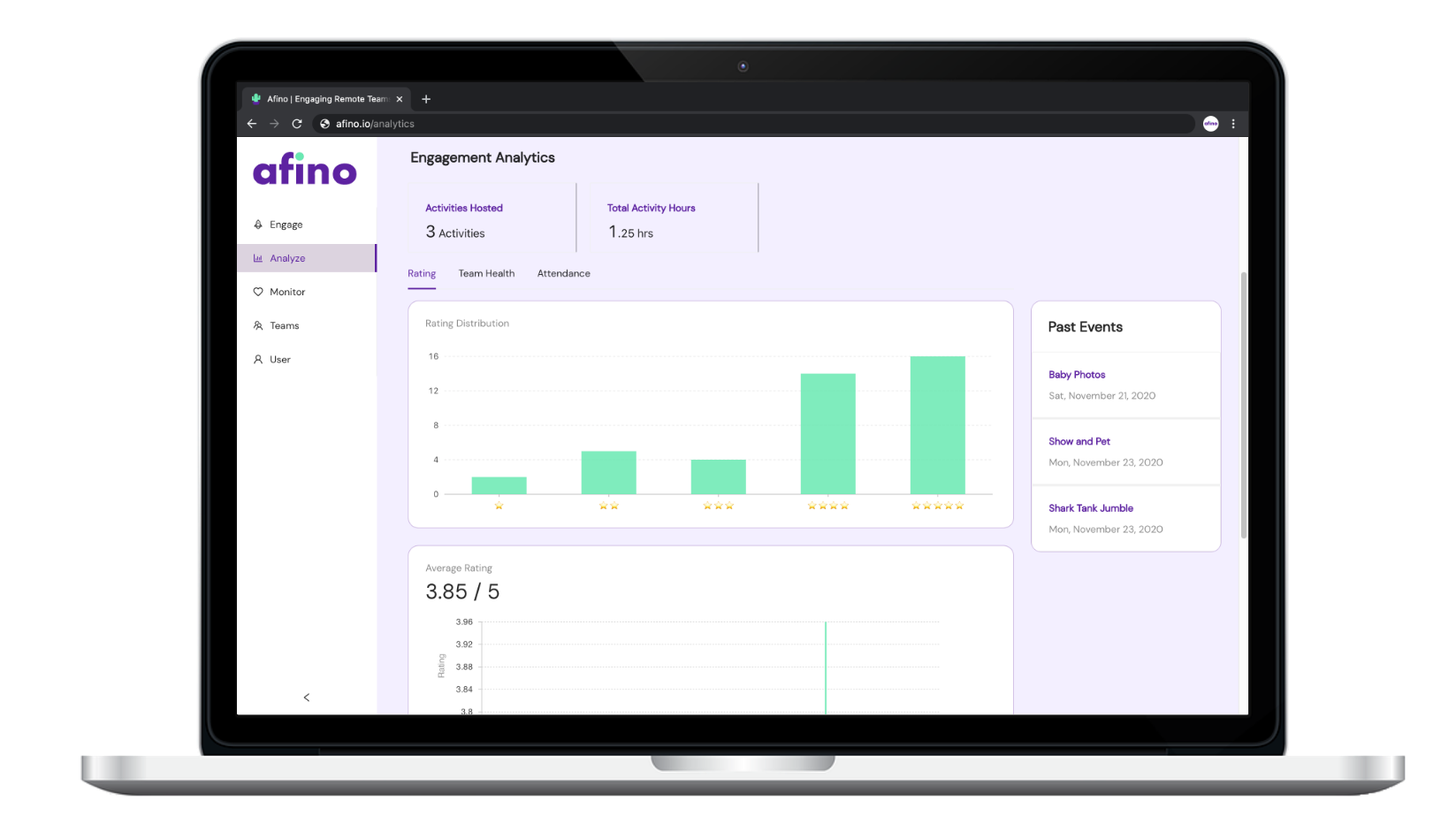
Step 2b) Each event you host will ask participants for feedback at the end. After clicking a past event, you will see the event rating, attendance, and written feedback.
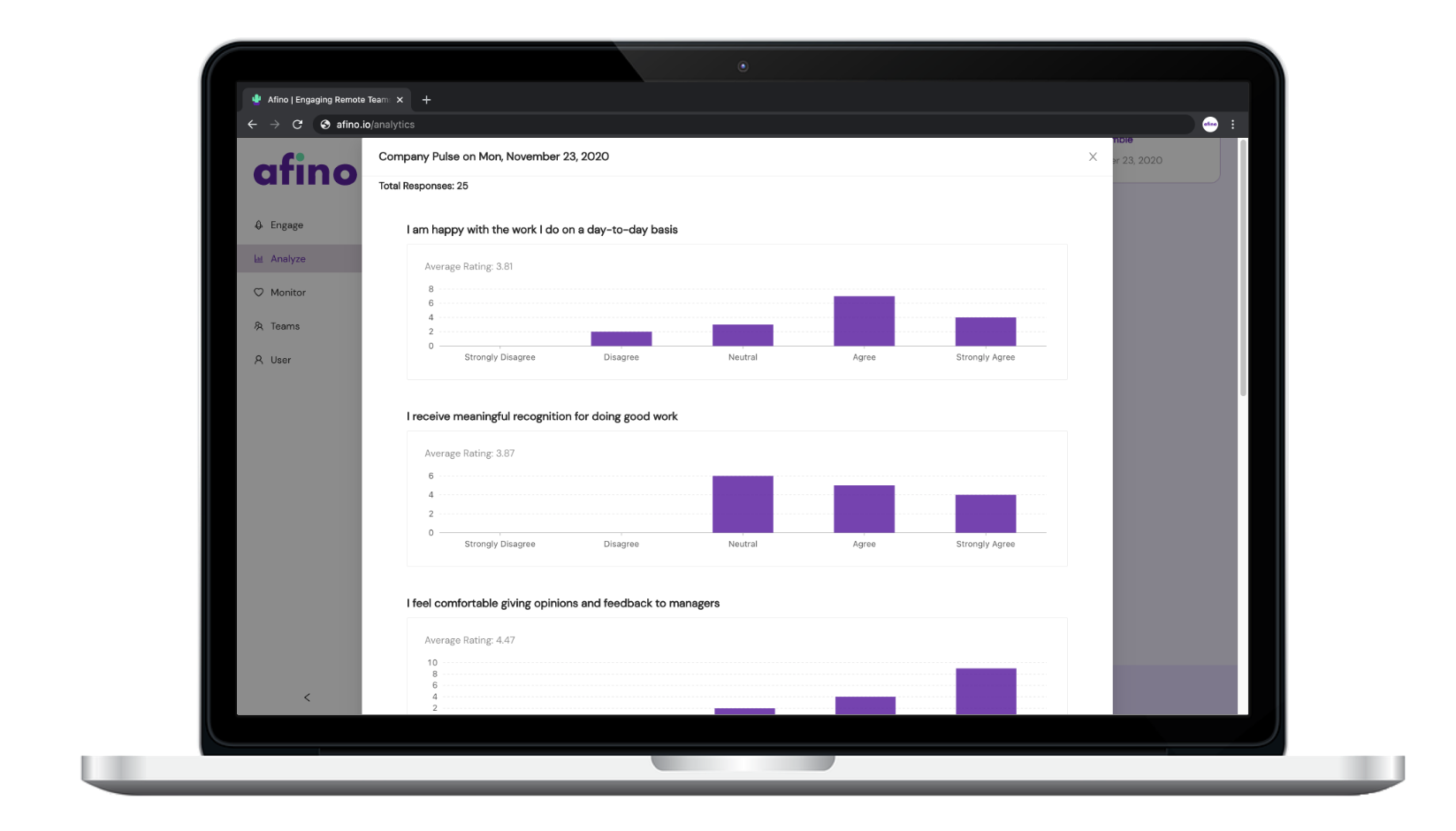
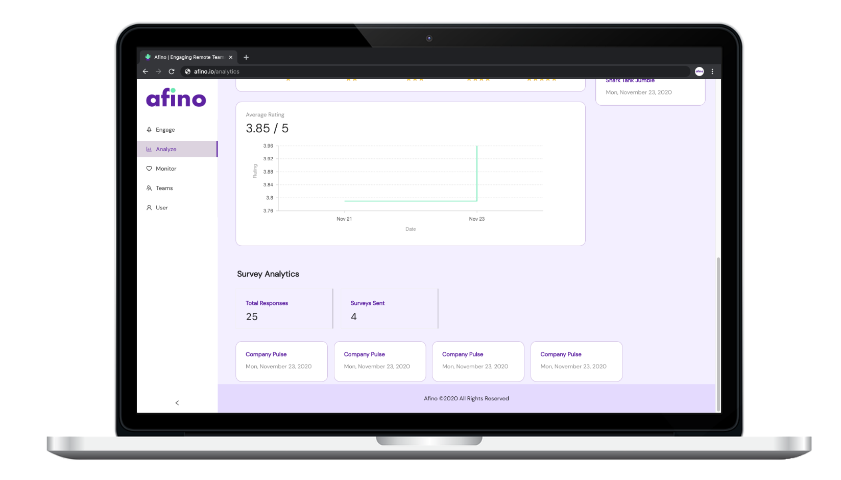
Step 3a) The final section is Survey Analytics. You can review total responses, the number of surveys sent and dive deeper into each survey's answers by clicking one of the past surveys.
Step 3b) Once you’ve selected a past survey, you can see the distribution of answers. You can also scroll to the bottom to access the survey link if you need to send it again.